Where possible I've tried to use the same windows and settings to demonstrate the buttons. Where applicable, the 'highlighted' button (ie the one which is under the mouse) is the 'Cancel' button. Not all the borders support this as it is a recent feature of post 6.01 Wimps.
 | Plain and boring 3D buttons and sunk icons. |
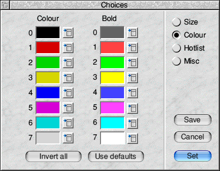
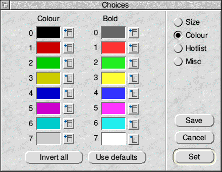 | Round buttons, with no other configuration selected. | |
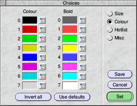
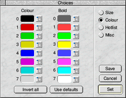
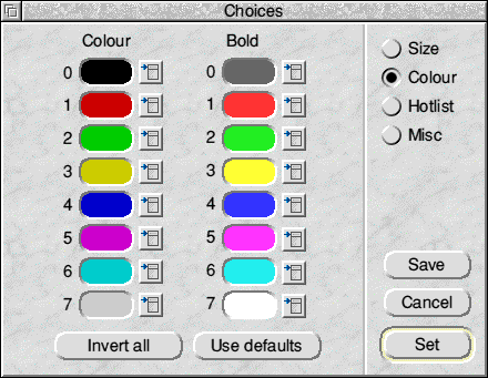 | Round buttons and sunken icons. The sunken icons are usually informational text, but in this example they provide a colour swatch for the user to select from. | |

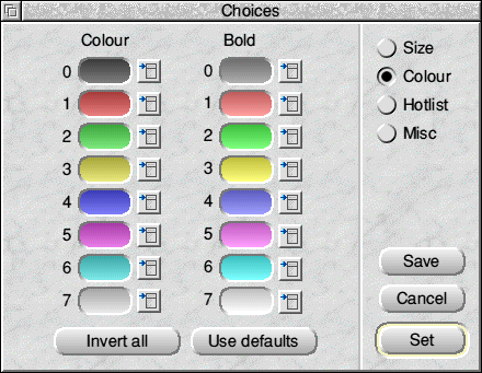
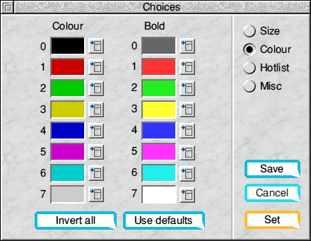
| Round buttons, with a fade between the 3D colours applied, making the button appear a little more 'round', or 'metalic'. | |
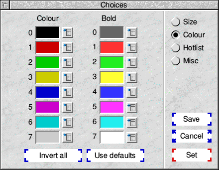
| Both buttons and sunken icons have the fade applied. Personally I don't like this for real use, and it makes the colour swatches a little more difficult to use (it's the colour in the middle of the icon that is the selected), but it looks cute. | |
|
Round buttons with a rim applied to them, and a special background colour.
The special colours mean that certain designs, in applications which use
colour for particular meanings, won't look quite right. But if you accept
that then it makes the buttons look rather nice.
The special colours can be chosen arbitrarily, and the text colour can be changed too, but the defaults you get when special is selected are the colours I settled on after much testing. Pastel colours work well, and full-bright colours do not. | |
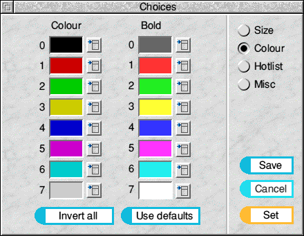
| As above, but also with the fade between top and bottom applied. My personal favourite. |
 | The fob is drawn with a circle segment on the left and four rectangles to make up the outside of the border. |
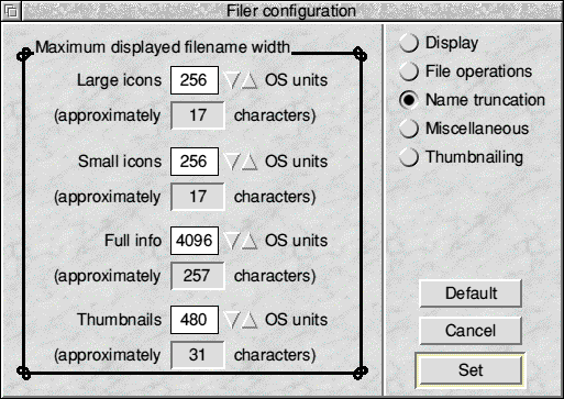
 | A solid outline is good; this borcder uses the corners to make a nice effect. |
 | Thin, delicate shapes don't work quite so well, in general. |
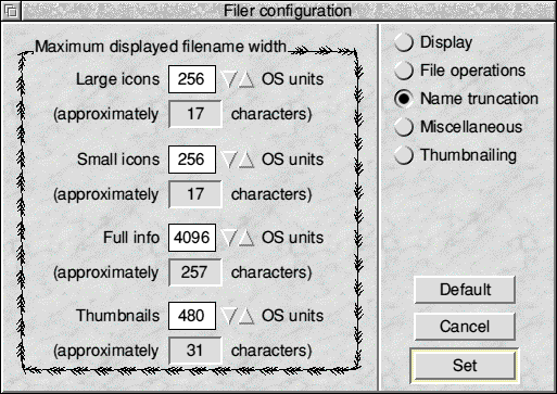
 | Shapes with patterns at the corners look good. |
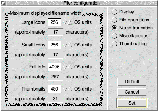
 | Blocky, continuous shapes work quite well. |
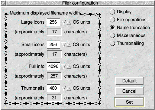
 | Very intricate shapes are depressingly poor, but might appeal to some. |
 | Buttons taken from a well known browser. |
 | These borders are actually more efficient in places than the Plain border implementation. |
I think it's safe to say that this is the worst example of a border that I've done, which is a pity given the amount of time spent on it. At least I know what doesn't work now.
 | There are quite a few triangles used to make up the border shape. |
 | The effect here is to change the shape of the border when the pointer is over the icon. The coloured section changes green when selected. |